Big decisions. Small screen.
What changes when a strategy game begins with a fingertip instead of a mouse pointer?
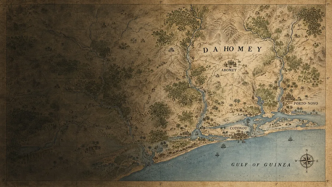
A phone is a different kind of playing surface. It is held close, often in one hand, and a finger briefly covers the very thing it is trying to select. Bringing a wargame to that surface means reconsidering the interface from the beginning.
Our aim for CAMPAIGNS is to keep the depth in the decisions and make the controls easy to understand. This is a design brief, not a finished feature list.
Make the next action clear
When a player selects a unit, the interface should answer three questions: what is selected, what can it do, and what would happen next?
We are exploring a clear separation between inspecting a position and committing to an order. Looking at a neighbouring space should not become an accidental move. Consequential actions deserve an explicit, readable moment of confirmation.
The exact interaction still needs testing on real devices. Large targets are a starting point; good spacing, contrast, and predictable behaviour matter just as much.
Give information a hierarchy
A small screen cannot show every detail at equal weight. The challenge is to decide what belongs on the map and what is better revealed on request.
Our working hierarchy starts with the terrain, the position of forces, and the current selection. Supporting details can sit in a compact panel. Longer explanations belong one step further away, available when needed without covering the entire situation.
This is not simply a question of reducing text. A symbol that takes a paragraph to explain may be less useful than a short, clear label.
Design for returning
A mobile session may last several minutes or end with an incoming call. A useful interface should help a player regain context after that interruption.
We want to explore how a concise turn summary, a visible objective, and a consistent selection state can make returning easier. Each needs to earn its place through testing rather than becoming another layer of interface furniture.
Let the map do the work
The best outcome is an interface that feels quiet. The player spends their attention reading the situation, comparing possibilities, and making a choice. Buttons and panels support that process without becoming the main event.
That is the standard we want to work toward: a map you can read, controls you can trust, and decisions you remember.